
You wake up, tap your phone’s ‘update’ button (Just to get rid of the notifications – for OCDs like me) and the next thing you know, it’s the biggest mistake of your life.
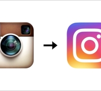
Instagram’s new logo is now completely unrecognisable. It’s like looking for your sunglasses only to realise it’s on your head all this while. So what happened with our beloved photo-sharing app? Instagram’s Polaroid camera icon has been replaced by a simplified camera complete with a rainbow-coloured gradient. (Or how I would imagine Unicorn puke) The blue-and-white interface is now black-and-white.
But let’s maintain some objectivity here. I’ll try. Ok so, as you can imagine, this sent avid Instagrammers (like me) into a near hysterical frenzy. I wasn’t alone – the rage game was strong online from Mozambique to Melbourne. Let’s all observe a moment of silence for this beautiful logo, born 2010. #RIPBelovedInstaLogo
All Logos Evolve
Customers change. Their tastes and buying habits don’t stay the same forever. To stay relevant, companies have to evolve accordingly. For example, by introducing introduce new products, improving old ones or removing them altogether.
To communicate the company’s new direction, the starting place is always the logo.

Starbucks is more than just coffee. They want to be the third place – the place to hang out after home (first place) and the office/school (second place). People already associated Starbucks with coffee. How do you evolve the brand? By dropping the word ‘coffee’.

For many years, Google is synonymous with search. Their mission is to compile and organise the world’s information. Thanks to the growing trend in mobile usage, Google felt it needed a logo that was more suitable, i.e. friendlier for smartphones.
On a side note, brands sometimes not only have to change their logo, but also their name. For example, Olay used to be known as Oil of Ulan and Darlie used to be known as Darkie.

As the product’s formula changed over the years, the original name no longer fit with what consumers have come to expect from Olay – a light, greaseless formula that absorbs quickly into the skin. Thus, Oil of Ulan and Olay were shortened to just Olay.

No prizes for guessing why they changed their name.
Instagram Yesterday And Today

Instagram was launched in 2010 and it started off as a simple mobile photo-sharing app that lets users edit pictures with retro filters, giving them a sense of nostalgia. And that was what Instagram is all about back then. People use Instagram because of its unique filters.
However, that’s no longer the case today because most users have turned to better alternatives like VSCO and Afterlight. Also, with Instagram’s supporting apps Layout, Boomerang and Hyperlapse, users can now do so much more like photo collages, time-lapse videos and loop videos.
“When Instagram was founded over five years ago, it was a place for you to easily edit and share photos. Over those five years, things have changed,” says Ian Spalter, Instagram’s Head of Design. “Instagram is now a diverse community of interests where people are sharing more photos and videos than ever before, using new tools like Boomerang and Layout, and connecting in new ways through Explore.”
Also stated in Instagram’s blog: “Our updated look reflects how vibrant and diverse your storytelling has become.”
Currently, Instagram has 400 million users sharing more than 80 million photos and videos every day. It only makes sense that the app needs to keep up with its evolving audience.
My Love-Hate Relationship With Instagram’s Facelift
Instagram has invested many years in building up visual brand equity with its previous skeuomorphic (literal depiction) style retro logo, which we have come to recognise. I suppose it’s thought to be acceptable to reinvent its logo into a completely abstract one, assuming everybody already knows what Instagram is. Plus, having a flatter UI icon design does have more adaptability when applied across different mediums, be they traditional or digital.
However, as a loyal Instagram user for the past four years with over a thousand photos posted up so far, I felt really angry and betrayed when I first learned about the logo change. It’s like someone had just ripped my digital soul apart. But I guess it’s normal because it’s something I, together with most other users have been accustomed to for so long, so much so that we resist change. It’ll definitely take some time for us before we get used to the new one.
Despite hating the whole logo and interface changes in the beginning, I do agree now that the monochrome design does give the content more emphasis. In other words, the white background acts as a clean canvas for pictures and videos to stand out more.

The only thing I don’t like about it is that the colour of the user’s handle and the captions are both in black. Although the only differentiator is one is in bold, it somehow still affects the overall readability.

Instagram might roll out a new look and feel, but it still carries the same meaning and values. Anyway, it’s just my two cents. Let us know what you think in the comment section below!
How would you evolve your brand?
Don’t want to miss out on the weekly shots of branding? Subscribe to our e-newsletter.
How would your brand participate in the golden age of the geek?
Don’t want to miss out on the weekly shots of branding? Subscribe to our e-newsletter.